In addition to creating one of my favorite art pieces ever, this song of mine, that had been started over a year ago, finally came together with a push of inspiration. I was only really missing an ending that would properly wrap up the song, and once I had that, I took to making the video. The pastel rainbow color scheme of the artwork worked so well with the hue change keyframes in After Effects, along with this super cool hexagonal audio visualizer I made. As far as production value goes, this is the best video I’ve made on my channel, in every aspect.
The major difference between User Interface Design I and II was that our choice of site to redesign was much more limited. While before we could choose whatever site we wanted, we had to pick a type of site that was very content heavy, specifically a news site, as directed by our instructor. Since I rarely pay attention to the news, I was a bit reluctant to get started, but soon realized that it’s essential that I need to be open to all types of sites and configurations, since there are sites for almost anything, and I could be working for any one of them someday as a user experience designer. It was a necessary pull out of my comfort zone, and it gave me a huge confidence boost when the ideas started flowing in.
In my search for a news site that I would be interested in working with, I came across ARTnews, which is dedicated to updating the art connoisseurs of the world on what’s happening in the art world. Unfortunately for them (and fortunately for me), there were quite a number of issues I ran into while exploring the site that could be innovated on. The search bar gives you two categories to search from, but neither of them are clickable, and the navigation of the site is incredibly confusing, some heading tabs leading you to other sites entirely. While I was not able to address the search issue, since I hadn’t learned coding at the time, I was able to greatly simplify the site navigation by prioritizing the main interests of the company (gaining more subscriptions, since they advertised it heavily throughout their own pages), while putting the other specifications in the menu. The rest of the page displays the leading articles, editor picks, most recent uploads and top stories, taking up the majority of the screen space with large and attention-grabbing pictures.
This was also the first project in which I had to consider responsive design, and I ended up creating three different page layouts for the website: mobile first, then tablet, and lastly desktop. While it’s structured in such a way to give more breathing room, rather than needing to remove items that wouldn’t fit in smaller designs, filling in the open space was also relatively difficult. However, I felt it was important to do so, since the site had a lot of white space at the time, but it felt somewhat contradictory to the nature of museum art as a whole. Some of the images were nice and big, like a large painting on display, while others were more subtle and less visible. I aimed to treat each image like it was a painting, with large blown up pictures in a gallery view with “museum placards” beneath to display the article title. I also amped up the immersion further within the mobile designs, as the images contained in the articles, once just thrown between large text walls in white space, became one with the article itself. Each image was placed in the background behind the text, as though you are looking into the framework of the painting itself. If you wanted to get a closer look at the painting itself, you could click on the title of the painting, or the “view image” link if it was not listed, and it would bring you into an isolated space with a dark background and an overhead light, as if you were actually in an art gallery to divert your full attention to it. The desktop space, however, was too wide to display the whole images in the background, so I placed it along the sides of the paragraphs for people to view while reading, rather than after reading the section. This prevents readers from having to go back if they forgot some details about the piece that were already written.
As one of my most in depth and successful projects at Drexel so far, Dine With Dragons was an app that I designed as a Drexel centric payment app that would allow students to pay for meals together without having to divvy up costs after the fact. It is not a fully functional app, but it has been outlined and prototyped with Figma, displaying comprehensive details on the inner workings and an interaction demonstration fully animated in Adobe After Effects. This was my final project for my Interaction Design class, and perhaps I can fully realize it in the years to come at Drexel.
My initial inspiration / example service to work from was Venmo, and I had to pick it apart to isolate a singular task flow that a person would go through when using it. The only problem was that I hadn’t ever used Venmo before starting this project, only knowing that it was specifically used for paying other people, and I ended up missing some steps in the task flow. As a result, my own app design had to be built more off of my own ingenuity, imagining how it would have to function as a legitimate product, and there ended up being more steps than necessary. However, for the main stand-out function of the app, allowing multiple people to join in on a single transaction, it panned out very smoothly in the end
Dine With Dragons initial task flowDine With Dragons IX flow
Where my creative ability really took flight was in the animation process. Seeing my ideas all come together in a realistic in-app experience gave me so much more confidence in the structure I had built. Everything happens so quickly and smoothly that it could very well work as a real application, and that gives me the motivation to pursue this further in the future. Not all of my animation ideas could be realized, such as a more realist coin drop animation, but it still looks polished and functional. For my first time using After Effects too, I’m incredibly proud of the end result, and have been working more with the program to fine tune my skills.
Dine With Dragons interaction guide
For a closer look, download the final presentation here.
For my final project in my Maker Workshop class, I decided to make a music box since I know a bit about composing music. The end result is displayed above, operating with a hand crank to control the dancer and a push-button system for the music and the lights. It plays three different songs that I wrote, Kitten Waltz, Skate Away, and Melody Meadow, in that respective order.
I had hoped that I could have a stepper motor operate at the same time so I would not need to manually spin the dancer with a cardboard gear system, but the codes I found would not properly mesh together and my instructors were incapable of figuring it out either. The RGB bulb was also giving me problems when I tried to install it on the outside of the box with conductive tape, causing my D Cell battery to malfunction. However, I was saved when one of my classmates told me that their portable phone charger worked to power the Arduino Board, so I used my own as a replacement battery. To not risk damaging the charger, I decided to use an alternate method of shining the bulb on the dancer: keeping it on the breadboard inside, but cutting a hole in the top that the light would shine through to bounce off a tinfoil mirror.
Boring Town – Based off a photograph I took in town
The assignment for my Design for Media II class was to take an image and trace over it using vector lines in Adobe Illustrator, grayscale only. It was originally intended to use a film still, but since I haven’t seen many movies lately, I showed my sample image to my professor and he okayed it. The shot itself was taken for my photography class too, and I found it to be interesting compositionally, with the three foreground poles segmenting the image into thirds. I put the most detail in contrast in the foreground and reduced them both for the mid ground and background components.
Tracing the details of the vehicle was rather time consuming, so my solution was to give a rough outline of an individual car with some basic shading and copy and paste it three times to fit with the melancholy theme. Many of the background details are omitted as well, helping to give that sort of flat and faceless feel to the building.
For the midterm project in Maker Workshop, we were given a rather open ended premise: make a thing that does a thing. My inspiration came from the fact that I had so many empty bottles of Bai in my room since I was too lazy to take them to the recycling bin. Good thing I decided not to throw them out, because it allowed me to make this awesome lamp. It contains eight LED bulbs of 4 different colors, red, green, blue, and white, and you change the colors by rotating the battery component in the middle. It may not be very bright, but it looks really cool when the bottles are illuminated in the dark. Upon completion of the project I took it down and placed it on top of my desk overhang so its light is more effective.
Internal circuitry of the lamp
The construction process took between 10-15 hours because of a number of setbacks with the central battery component. The base circuitry was rather simple though. It just took a long time to piece together and to get the glue to dry. To light up an individual bulb, a series circuit is made by placing the conductive tape on the battery component on top of the conductive tape inside the lamp, thereby completing the circuit. Because the battery holders would not allow for two circuits to be attached to a single battery, I had to use a second one for the second side. The second battery holder is flipped around so the center piece can rotate in either direction to still have a working connection. I taped the two of those to a flat piece of cardboard that I intended to attach to another bottle that would go through the center hole that I could use as the rotator handle.
The tricky part was getting the conductive tape “switch” to stay closed. For a while, I thought I had not connected the conductive tape correctly, but after pushing down on the battery pack and getting it to light up, I realized it was an issue with weight distribution and balance. The top component needed to lay perfectly flat on the conductive tape or it would not complete the circuit. I had to dismantle and recreate the battery component a number of times to try and get it right. Some of my ideas include using magnets to firmly pull down the battery (which likely didn’t work because of the way magnets and electricity interact), weighing it down with a large roll of tape, adding more cardboard on top, layering conductive tape on, and even using some springs from pens as a conductor that would go on the battery component, but all of them would not produce a consistent light.
Battery component
The eventual solution I came to was to create a bubble in each of the conductive tape portions on the battery component and have them be squished down by a large brick of cardboard. In doing this, the component no longer needs to lay completely flat. The little bulge in the tape just needs to be touching, and since it is squished down by the cardboard on top, that gives it a greater chance of creating a stable connection. Despite the large amount of stress this project gave me with its number of failures, and the load of work for other classes that I decided to complete afterwards, I am glad that I powered through and found a solution, as it still makes for a nice room decoration that I can talk about if anybody visits my dorm when Covid is gone.
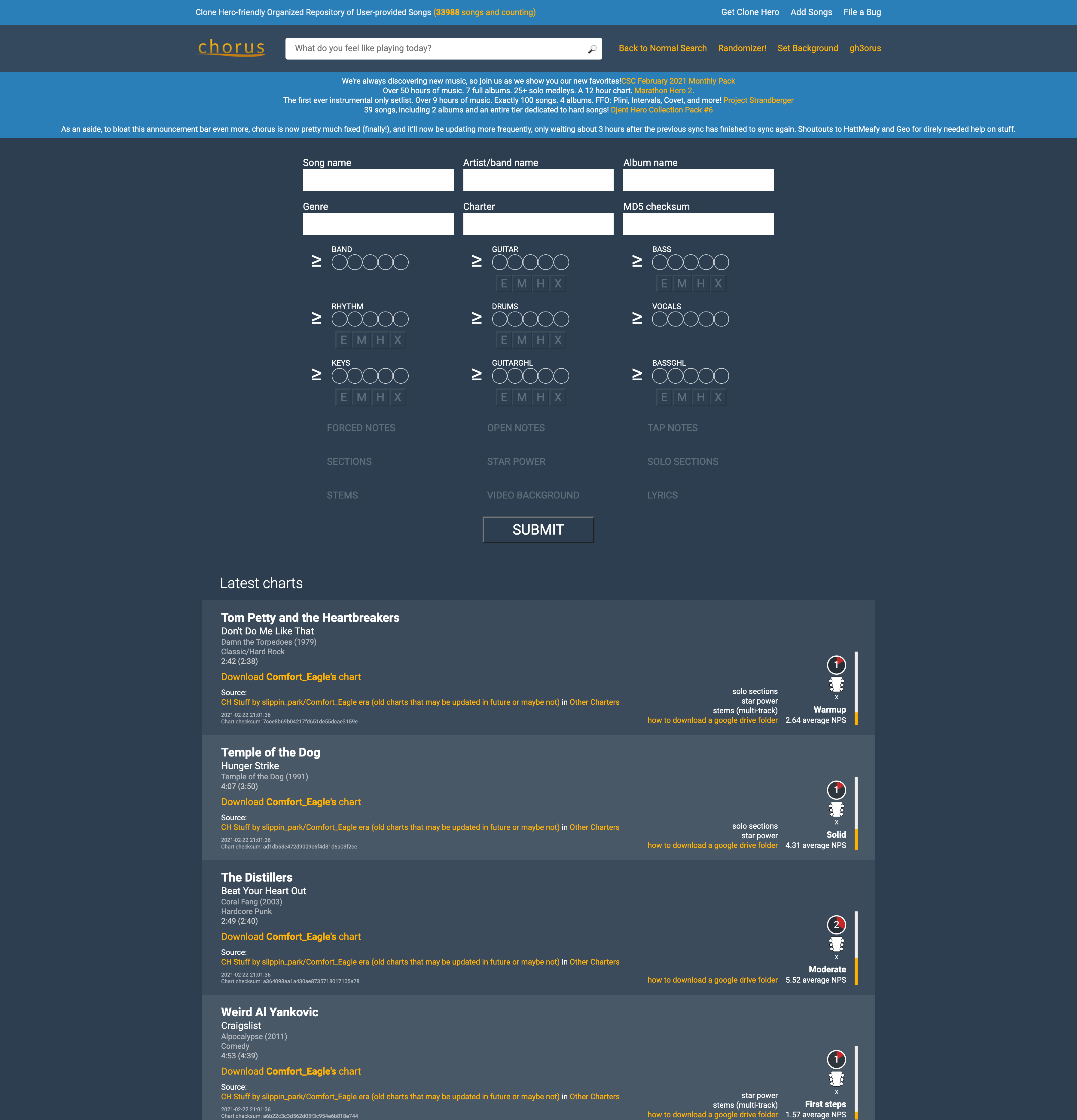
A site unfamiliar to most, yet important to me, is the site that I used to download much of the necessary content to play the game Clone Hero, which is essentially a computer version of Guitar Hero that gives you access to all existing songs from the Guitar Hero games and various community made songs. The site as it stood worked decently to find some individual songs, but I felt that the layout could be improved to allow for easier filtration and analysis of the songs before somebody goes to download a song. You can really only find songs that you know specific details about, like the song name and the artist, or details about the chart of the song, such as the difficulty and the playable instruments.
To give users a better way of looking for new songs to download, I redesigned the filtration system to be more concise and easier to understand by lining it up with details listed on the song. Once this design is coded and implemented, users will not only be able to search for songs based on chart and song details but through how many likes and downloads are on a specific chart. If the user comes across a song they may wish to download, instead of downloading it into the game to check, they could click on the album cover to the left hand side to play a preview of the song. As it stands, many Clone Hero players will download large packs instead of individual songs so they could listen to the previews in game. Those would also be available on the home page in the new setlist carousel, as they are popular among players, but for those that are not looking to use up large amounts of space on their computer for songs they will not end up playing, this system of song searching will be much more effective for handpicking the songs that players want, rather than just guessing at which packs to download.
Song download page, before and after
The design process was interesting to follow through for the first time, as my site choice was rather obscure and the user base was very specific. Quite literally, only people that have Clone Hero will have anything to get out of this site, and since I play the game avidly, I had a decent understanding of the user base. Just to be sure though, I was instructed to develop a user persona and do a card sort test to see how users organized the content on their site. Most people organized the content by official Guitar Hero content and community content, but a decent portion split up the large setlist and the individual charts, so I added different tabs for the both of them. The prototype does not include all the pages of what the finished site would have, only the home and chart page, but within this version, the carousel can move back and forth and the dropdown filter on the chart page is functional.
Card sort results: Separation of setlist and individual songs
To view the full case study, you may download it here.