Big news everyone! As I’ve been going through my courses at Drexel, I’ve been learning the basic coding skills required to make a functional website. As such, I will be putting the majority of my attention there instead, as it continues to grow with my knowledge of HTML, CSS, and Javascript. Take a peek for yourself!
The major difference between User Interface Design I and II was that our choice of site to redesign was much more limited. While before we could choose whatever site we wanted, we had to pick a type of site that was very content heavy, specifically a news site, as directed by our instructor. Since I rarely pay attention to the news, I was a bit reluctant to get started, but soon realized that it’s essential that I need to be open to all types of sites and configurations, since there are sites for almost anything, and I could be working for any one of them someday as a user experience designer. It was a necessary pull out of my comfort zone, and it gave me a huge confidence boost when the ideas started flowing in.
In my search for a news site that I would be interested in working with, I came across ARTnews, which is dedicated to updating the art connoisseurs of the world on what’s happening in the art world. Unfortunately for them (and fortunately for me), there were quite a number of issues I ran into while exploring the site that could be innovated on. The search bar gives you two categories to search from, but neither of them are clickable, and the navigation of the site is incredibly confusing, some heading tabs leading you to other sites entirely. While I was not able to address the search issue, since I hadn’t learned coding at the time, I was able to greatly simplify the site navigation by prioritizing the main interests of the company (gaining more subscriptions, since they advertised it heavily throughout their own pages), while putting the other specifications in the menu. The rest of the page displays the leading articles, editor picks, most recent uploads and top stories, taking up the majority of the screen space with large and attention-grabbing pictures.
This was also the first project in which I had to consider responsive design, and I ended up creating three different page layouts for the website: mobile first, then tablet, and lastly desktop. While it’s structured in such a way to give more breathing room, rather than needing to remove items that wouldn’t fit in smaller designs, filling in the open space was also relatively difficult. However, I felt it was important to do so, since the site had a lot of white space at the time, but it felt somewhat contradictory to the nature of museum art as a whole. Some of the images were nice and big, like a large painting on display, while others were more subtle and less visible. I aimed to treat each image like it was a painting, with large blown up pictures in a gallery view with “museum placards” beneath to display the article title. I also amped up the immersion further within the mobile designs, as the images contained in the articles, once just thrown between large text walls in white space, became one with the article itself. Each image was placed in the background behind the text, as though you are looking into the framework of the painting itself. If you wanted to get a closer look at the painting itself, you could click on the title of the painting, or the “view image” link if it was not listed, and it would bring you into an isolated space with a dark background and an overhead light, as if you were actually in an art gallery to divert your full attention to it. The desktop space, however, was too wide to display the whole images in the background, so I placed it along the sides of the paragraphs for people to view while reading, rather than after reading the section. This prevents readers from having to go back if they forgot some details about the piece that were already written.
The only photography class I’ve taken was taught in black and white, so that is what I am most familiar with. That’s definitely not a bad thing though, because I’ve gotten really good at it. I particularly enjoy using the lack of color to put emphasis on other design features of each photo, such as the geometry and framing, which is the main variable in this set. I had gone out with my friend Sydney to capture some, since she is taking the class this term and I wanted to explore the limits of contrast with her. Despite the melancholic demeanor of these few, we had a good time.
That being said, the theming behind this little collection is based on some thoughts that pass through my head at times, like weary travelers looking for a place to stay for a while. I take them in and turn them into something beautiful. It’s an interesting double standard, how most of the joy in my life comes from my creative outlets, photography included, yet my main inspiration is rooted in despair. Perhaps it’s the thought that my free-flowing ambitions aren’t enough on their own, as a career. “Visions Imprisoned,” I feel, best captures this emotion, for my will to create will need to be shelled up into the inflexible foundation of societal worth, an artistic eye peering through metal bars.
One of my favorite things about photography is the use of lighting and color to give a whole new meaning to a subject. The geometry and makeup of a subject matter has its own allure, in the sense of choosing what angle you want to snap the shot at, making them more visually interesting, but the entire mood of a piece can shift based on the color and brightness of what you’re seeing. Though in part because I have not yet experimented with the brighter options that my Cannon has to offer, I find it much more intriguing to explore the power of darkness in my photos. Sadness and fear, though often seen negatively in our modern world, are often a lot more fun to experiment with in the art world for just how raw it can get. For this collection of photos in particular, I used a low ISO and deep shadows to capture elements of the building I live in, along with an extended metaphor of a building being comparable to a living body, to create an incredibly ominous and foreboding experience through each capture.
As one of my most in depth and successful projects at Drexel so far, Dine With Dragons was an app that I designed as a Drexel centric payment app that would allow students to pay for meals together without having to divvy up costs after the fact. It is not a fully functional app, but it has been outlined and prototyped with Figma, displaying comprehensive details on the inner workings and an interaction demonstration fully animated in Adobe After Effects. This was my final project for my Interaction Design class, and perhaps I can fully realize it in the years to come at Drexel.
My initial inspiration / example service to work from was Venmo, and I had to pick it apart to isolate a singular task flow that a person would go through when using it. The only problem was that I hadn’t ever used Venmo before starting this project, only knowing that it was specifically used for paying other people, and I ended up missing some steps in the task flow. As a result, my own app design had to be built more off of my own ingenuity, imagining how it would have to function as a legitimate product, and there ended up being more steps than necessary. However, for the main stand-out function of the app, allowing multiple people to join in on a single transaction, it panned out very smoothly in the end
Dine With Dragons initial task flowDine With Dragons IX flow
Where my creative ability really took flight was in the animation process. Seeing my ideas all come together in a realistic in-app experience gave me so much more confidence in the structure I had built. Everything happens so quickly and smoothly that it could very well work as a real application, and that gives me the motivation to pursue this further in the future. Not all of my animation ideas could be realized, such as a more realist coin drop animation, but it still looks polished and functional. For my first time using After Effects too, I’m incredibly proud of the end result, and have been working more with the program to fine tune my skills.
Dine With Dragons interaction guide
For a closer look, download the final presentation here.
For the record, this project was done in a group of four, so I cannot take credit for everything. The other three members of my group were Preeti Shenoy Lianna Wang, and Kara Butler. The reason why I am including it in my own portfolio is because I came up with a lot of the ideas to add onto the final product.
Unlike the Gryphon Glove project, we were tasked with actually designing a product that would solve a problem that we would need to research. We had a lot of ideas from the get go, but our professor reminded us not to jump too far ahead too early to make sure we could refine it enough. Right away, we decided on creating a device to give college students with ADHD or trouble focusing a means of dealing with procrastination. Our team evenly split up the research and I was responsible for the neuroscience perspective on ADHD and potential causes. Then, we had to come up with 20 design ideas as a group, so we split it up evenly amongst the four of us. Many of ideas were very similar, and the idea we decided to go through with would be a little helper friend that would help you create and maintain schedules while giving encouragement towards your accomplishments.
Surprisingly close to the end of the project, however, I had thought of a lot of ideas that would make the design of our Study Buddy more effective. I remembered that my step mom has ADHD and that she has an emotional support dog that counts as a service animal. What’s a better buddy than a puppy? We had already thought of the schedule creation ideas that would be built into the device and its mobile app counterpart, but we quickly found a way to incorporate the dog aesthetic into the device. While the initial device would work on suggesting work times and giving reminders, the Study Pup and the Study Pup app would do all that AND motivate the user to adhere to their plans by directly connecting it to the dog theme. By completing your work on time, you can earn virtual credits to buy digital treats and toys for the dog on the app, similar to a Tamagotchi. Meanwhile, the physical robot dog would interact with the user, listening to what items they need to add to your schedule, and because it looks a little cartoony, it’s a talking dog that can give advice and reminders back to the user.
Study Pup + Usage Map
The most effective idea of mine, I believe, was to have the dog be powered by the user’s phone, which they would need to place inside a wireless charger “bed” that the puppy would sit in, covering up the phone and preventing it from being used while they are working. This cuts out a major distraction that has afflicted many students’ attention spans, not just those with ADHD. Certainly if this were a real product, there would be a manual override in case you needed to use your phone in an emergency call. Otherwise, with this product, people could develop better study habits and have fun doing so too, by taking care of their own little helper friend at the same time.
The topic of this project revolves around taking inspiration from a mythical creature and designing an existing product that incorporates that theme. My assigned product was a walkie talkie. Initially I was unsure about what kind of creature I would use, (mainly because I was fixated on the idea of incorporating the entire creature in rather than subtle hints) but I decided to go with a gryphon for my original idea of calling it “The Walkie Squawkie.” I didn’t have much more than that, and my base ideas were quite bland at the start, being essentially a walkie talkie with the head of a gryphon on it. Our professor had warned us about getting attached to our first ideas because it might deter us from more innovations, and it’s a good thing I listened to her advice.
After doing research about the creature and the history of the walkie talkie, we were told to come up with 50 ideation sketches for the final product. Getting to 50 was a daunting task as I was running out at around 30, but the last couple were completed by finding different variations of previously fleshed out ideas. The device took a number of different forms that looked nothing like a walkie talkie, which was frankly a good thing, considering it opened up a whole new horizon of ideas. After careful thought, I decided that the falconer glove idea would be the closest incorporation of both the walkie talkie’s portability and the lore of a gryphon.
Since walkie talkies were originally used as portable radios for wartime communication, I related that to carrier pigeons that would send messages across the battlefield. Instead of a pigeon, however, it’s the gryphon that is perched on the glove like a falcon. The little message is the scroll found in its talons. Because it works like a radio, however, the scroll is instead used to display the channel number. Additional inspiration for this combination idea came from my trip to the Renaissance Faire where I saw a falconer, and I thought a gryphon would fit right into the medieval theme. Gryphons are also known to mate for life, which to me can be converted to a powerful bond between a pet and its owner, and since they are a symbol of power in ancient depictions, it can be used as a metaphor for the power of communication. The gold lacing around the glove comes from the creature’s affinity for gold, and it makes for a rustic design that makes it cool to wear at any medieval themed event.
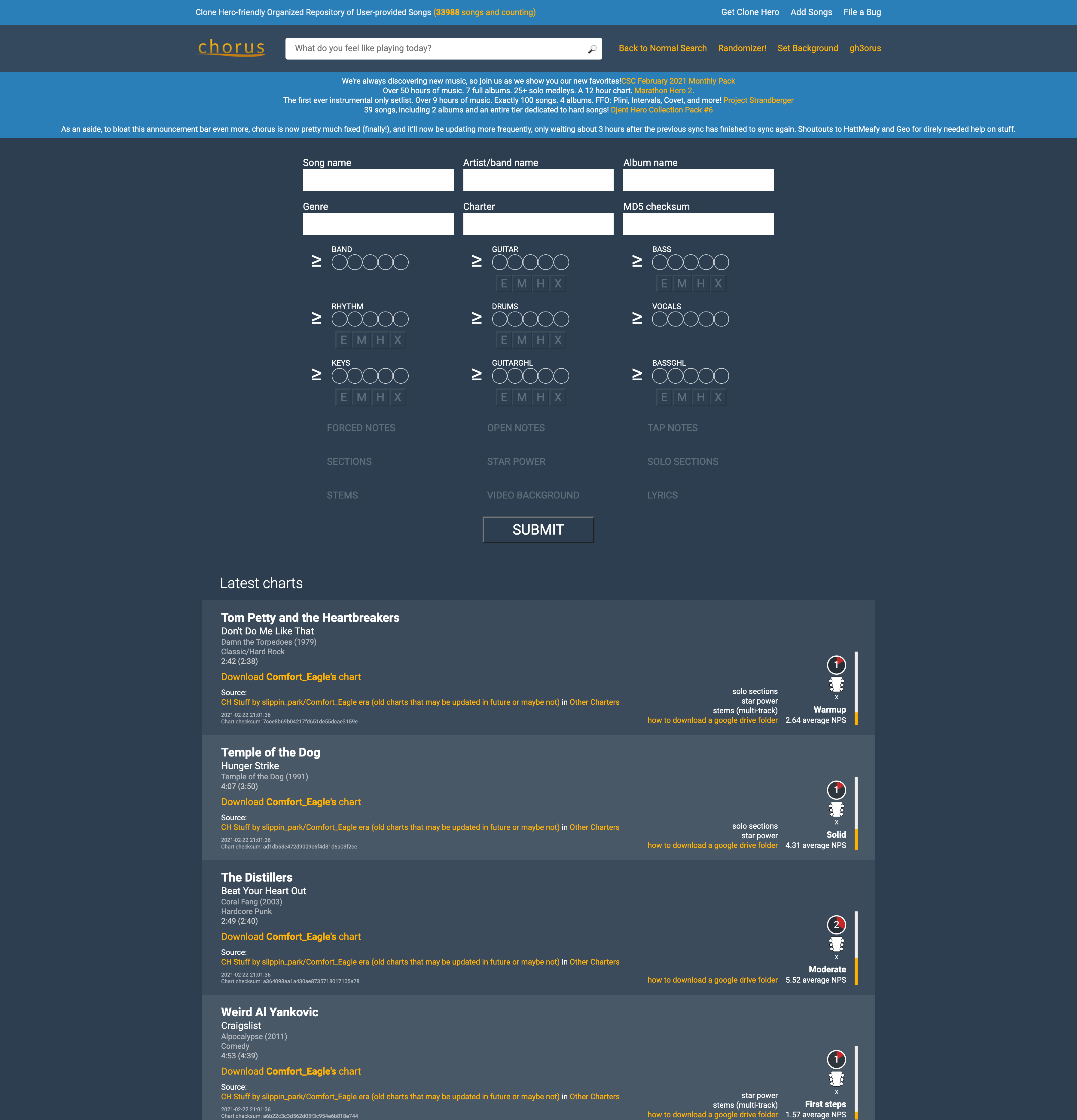
A site unfamiliar to most, yet important to me, is the site that I used to download much of the necessary content to play the game Clone Hero, which is essentially a computer version of Guitar Hero that gives you access to all existing songs from the Guitar Hero games and various community made songs. The site as it stood worked decently to find some individual songs, but I felt that the layout could be improved to allow for easier filtration and analysis of the songs before somebody goes to download a song. You can really only find songs that you know specific details about, like the song name and the artist, or details about the chart of the song, such as the difficulty and the playable instruments.
To give users a better way of looking for new songs to download, I redesigned the filtration system to be more concise and easier to understand by lining it up with details listed on the song. Once this design is coded and implemented, users will not only be able to search for songs based on chart and song details but through how many likes and downloads are on a specific chart. If the user comes across a song they may wish to download, instead of downloading it into the game to check, they could click on the album cover to the left hand side to play a preview of the song. As it stands, many Clone Hero players will download large packs instead of individual songs so they could listen to the previews in game. Those would also be available on the home page in the new setlist carousel, as they are popular among players, but for those that are not looking to use up large amounts of space on their computer for songs they will not end up playing, this system of song searching will be much more effective for handpicking the songs that players want, rather than just guessing at which packs to download.
Song download page, before and after
The design process was interesting to follow through for the first time, as my site choice was rather obscure and the user base was very specific. Quite literally, only people that have Clone Hero will have anything to get out of this site, and since I play the game avidly, I had a decent understanding of the user base. Just to be sure though, I was instructed to develop a user persona and do a card sort test to see how users organized the content on their site. Most people organized the content by official Guitar Hero content and community content, but a decent portion split up the large setlist and the individual charts, so I added different tabs for the both of them. The prototype does not include all the pages of what the finished site would have, only the home and chart page, but within this version, the carousel can move back and forth and the dropdown filter on the chart page is functional.
Card sort results: Separation of setlist and individual songs
To view the full case study, you may download it here.


 Paul's Portfolio